Sometimes you may be in the position to create a fast good enough UI for a prototype. Here are some quick tips for getting started.
First I will assume you already have an idea of what screens you will need. If not maybe write down some notes of screens you will expect to need (Menu, inventory, action buttons, etc). There is a popular thing UI/UX designers do called Crazy 8’s to generate some quick ideas for screens. Simply fold a piece of paper into 8 slices by folding it in half, and repeat folding in half 3x in total. Next set a timer for 8 minutes, and spend 1 minute drawing the idea of what the screen could look like per square. It’s just a way to generate ideas so don’t spend too much time here. You can likely skip this step and come back to it later after some inspiration if you need to or skip it completely if the next step is all you need.
Look for UI assets first
Don’t reinvent the wheel unless you have time to. Look in the Unity Asset store or whatever platform you use to see what is available first. There is a considerable amount that you can use as a starting point and it can save you time.

In no particular order here are a few free assets to check out, you can look for UI and GUI
- 3D Modern Menu UI (Free)
- SteampunkUI (Free)
- Clean Settings UI (Free)
- Fantasy Wooden GUI (Free)
- Sci-fi GUI skin (Free)
You can also use some free tools to create UI
(Shapes2D – Procedural sprites and UI)
For more custom controls & UI, I recommend the Lean series (Lean GUI – Free). There is quite a lot of free stuff you can work with if you check out the rest of his work
There are tons of great paid assets too, I’m not going to make a long list but I have a few I recommend.
- Shift – Complete Sci-Fi UI
- Controller Overlays & Button Kits (3 styles) x8 controllers + keyboard/mouse
- Countdown Pro
Get Inspired
Well, if you have browsed everything on the store you may realize they don’t have what you are looking for! That is where you find yourself needing to either mod UI from one of these packs or create it from scratch.
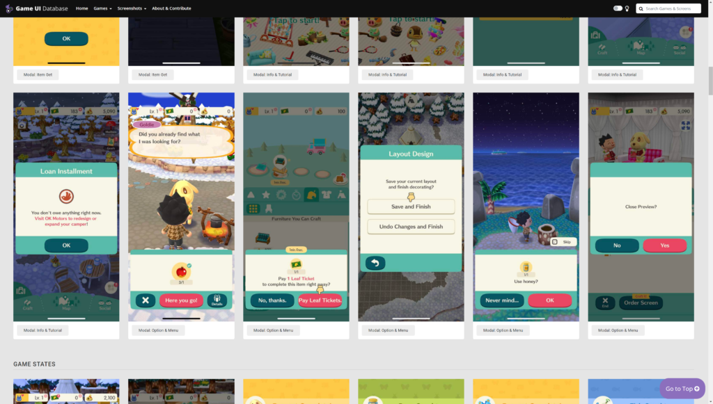
Either way, you will likely need some inspiration. Check out GameUIDatabase to get some ideas on design work.


Great place to reference screenshots of UI.
I recommend picking 3 games in the theme/style/genre you want and getting screenshots for reference.
You can also consider layouts by sites like Mobbin. Even if they aren’t game-focused lots of outside sources can be used for inspiration. Don’t be afraid to use outside resources.

What if you can’t find inspiration?
Well, time to do stuff the old-fashioned way!
Look up real-life items that fit your theme, be it books, menus, postcards, scrolls, or other things, and reference that…
You can also try and use art generators be it with templates or AI and see if that gives you something you can work with.

AI can do so much now
Copycat er…. Steal like an Artist*
Do you see some elements you want? Copy them and combine them. Then tweak 3 things about them – shape, color, and layout or proportion. You’ll find you end up with something professional that looks a little different than the original.
“Every new idea is just a mashup or a remix of one or more previous ideas.”
Austin Kleon
I often do this for UI elements and I tend to find I also have to change up the shading to match my style.
At this point, you’ll likely need to start prototyping some aspects of it and test if it’s readable.
Test it
From here you need to ask people some quick questions:
- What do you think this is?
- Can you tell me what it’s for?
- How or would you interact with it?
These often let you know if something is understandable at a glance. I’m not going to go into shape or color theory or elements of design but they are good to know.
Wrapping it up + Extra Tips
And that about covers it, I don’t talk about wireframing or spending a lot of time planning your idea out. I tend to work in short fast iterations, and recommend it for the best use of time.
I suggest making it practical before working on getting to details like fonts or particular styles. Most people use font pairs or font pair generators now or common design layouts so don’t reinvent the wheel unless you like to.
The last 3 minor tips.
- Test your font in a paragraph, title, and with a small screen. Does it work in all three cases? Should a more decorative title be used? Sometimes templates for that can be found free online but they tend to not be good with particular backgrounds… Does this text work okay on different backgrounds?
- Test international conditions early. Does the system support this font? This is particularly a problem with multiple languages. You may need to either do additional testing or use multiple fonts depending on how much space you have.
- Block out quick ideas with a set color scheme to see that it emphasizes the right sections. There are tons of color schemes available online. You can also grab colors from concept art, your own art, or photos just as fast. You could spend time storytelling with color but prioritize the most important elements first. Whatever the case, it’s up to you as the creator to decide how much attention you want to draw to the UI.

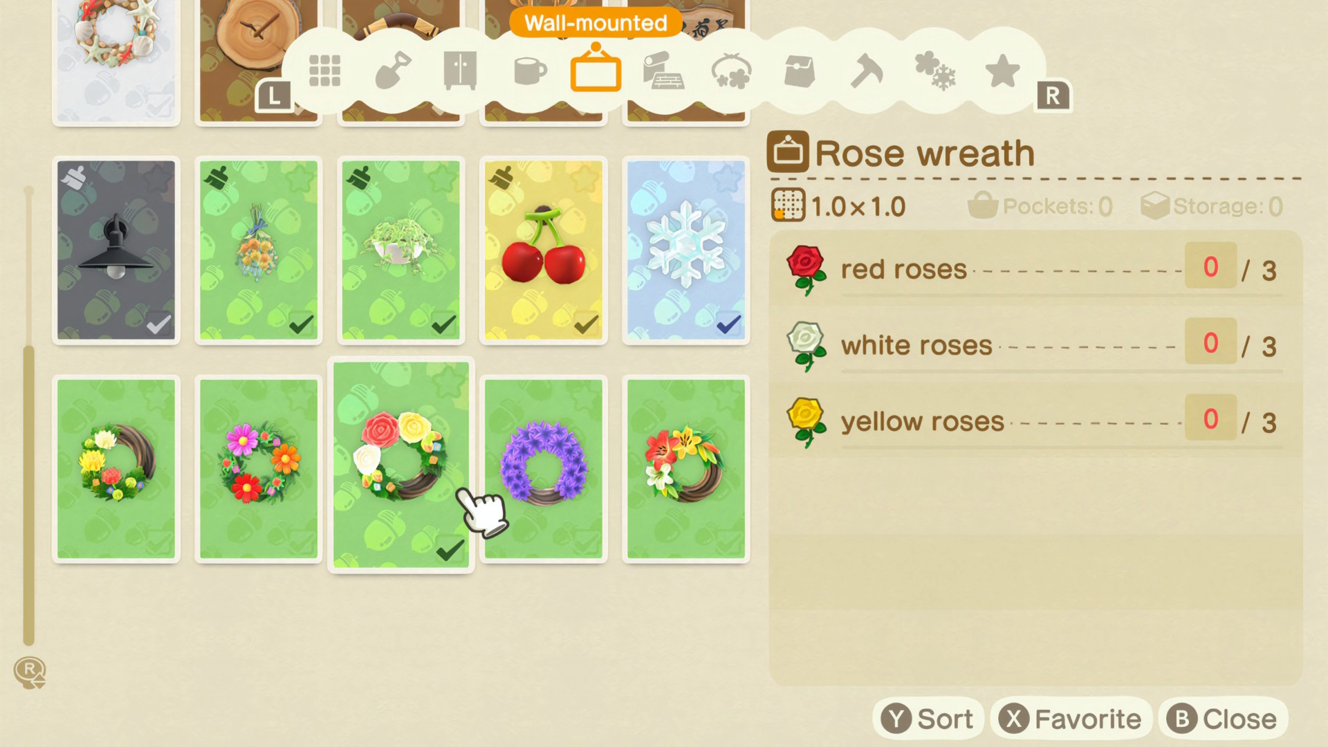
Blocking out the ideas above quickly 👆 Ultimately I combined a bunch of ideas.
This took just a few hours and will get faster the more resources and experience you have. The longer the project the more you should consider each use case of the UI. This project was very simple so a few hours is fine but complex projects can take a month+ to feel good. They may also change even further after some iteration and feedback. Also, if pieces of your UI are procedurally generated from code you will likely need more time for testing.


Leave a Reply