The Brief
3 Week duration • No Budget
My client was an imaginary transportation agency for a midsize metropolitan area in the Midwest.
They requested:
•The ability to tell when any bus arrives (particularly at the Washington & State bus stop)
•The ability to tell how much time they have to get to a stop before a bus arrives. (Particularly at the Washington & State bus stop)
•The ability to see bus schedules and future arrival times.
They budgeted one additional feature if time allowed
Problem Statement
My client needs a bus app that makes it easy to tell bus arrival schedules, how much time before a bus arrives and what busses are currently on their way.
Solution
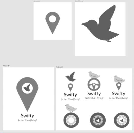
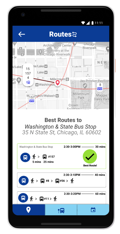
My final solution was a bus transit app that would show nearby bus arrival times, a full schedule and and nearby news updates. I called it Swifty as they are one the fastest birds around and this app will get you updates fast. You have multiple ways to search for information on the app, you could view by map, schedules, use a search bar and it also would show nearby bus arrival times by default for easy access.
Process
Competitive Analysis
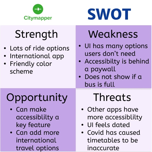
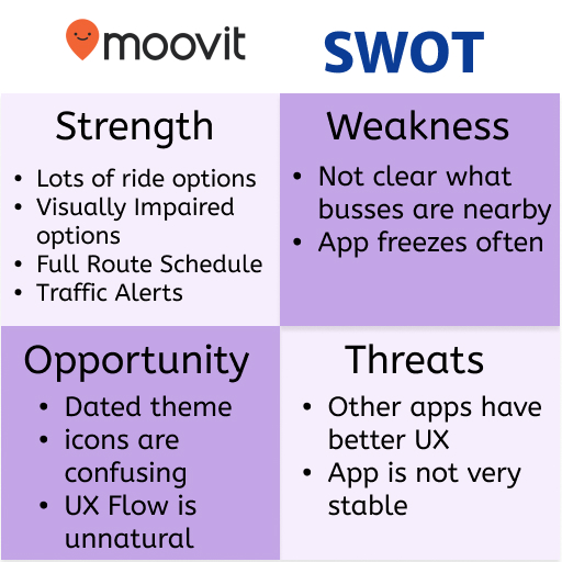
The process began with basic research collected. Here you can see some of SWOT analysis gathered from other public transit apps. Below is a sample of some of my SWOT.
User Surveys & Interviews
After this I created a survey to understand my users better. I collected a variety of data and was able to gain some insights from it. I also used this to help setup interviews later on.
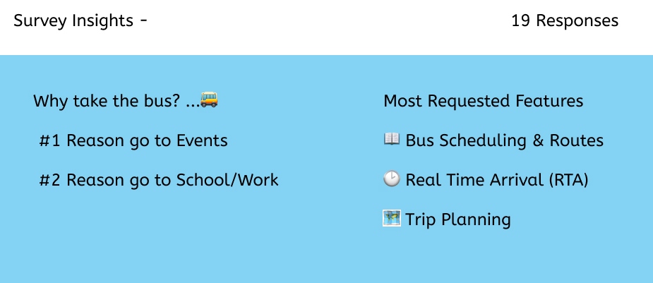
Some other important insights were:
The two biggest requests to improve public transit was to ensure buses arrived on time more often and safety concerns. I later addressed the time concern by including real time info and suggested a news & traffic feature to help with safety.
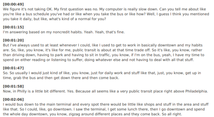
I interviewed a few different people over Zoom asking them about their experience riding the bus, what apps they preferred, features they wanted, why they rode the bus and so on. I was still able to gain further insight and learned about new apps that they recommended I try out for research.
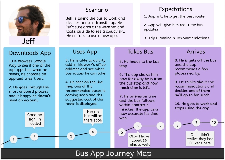
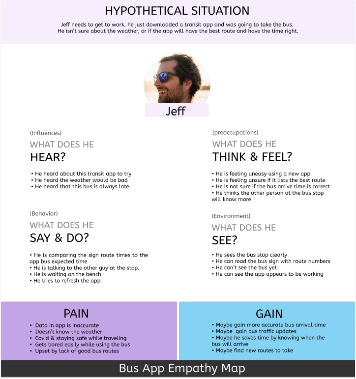
User Personas, Empathy Maps, Journey Maps
Using my interviews and survey’s I was able to create different personas and empathy maps that would help me think further of user stories down the road.
User Stories
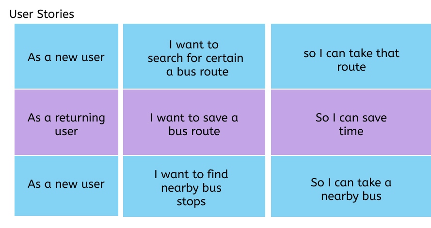
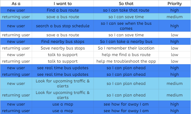
Using my different personas, and scenario’s etc I started to write out different users stories to prioritize what would be most important to focus on in the app.
Sketches and User Flows
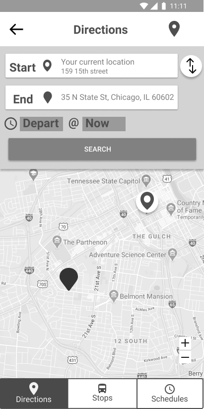
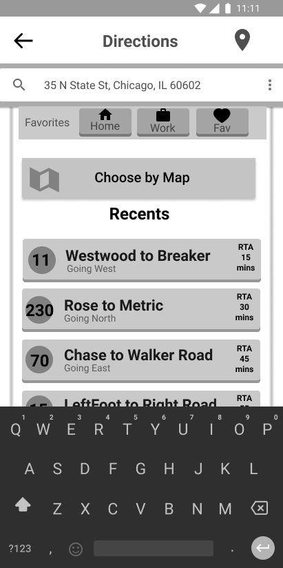
I personally need to sketch out a layout to help me think of different user flows and user stories. I studied some of the competition and worked out a basic sketch from them I used as a starting point for my app.

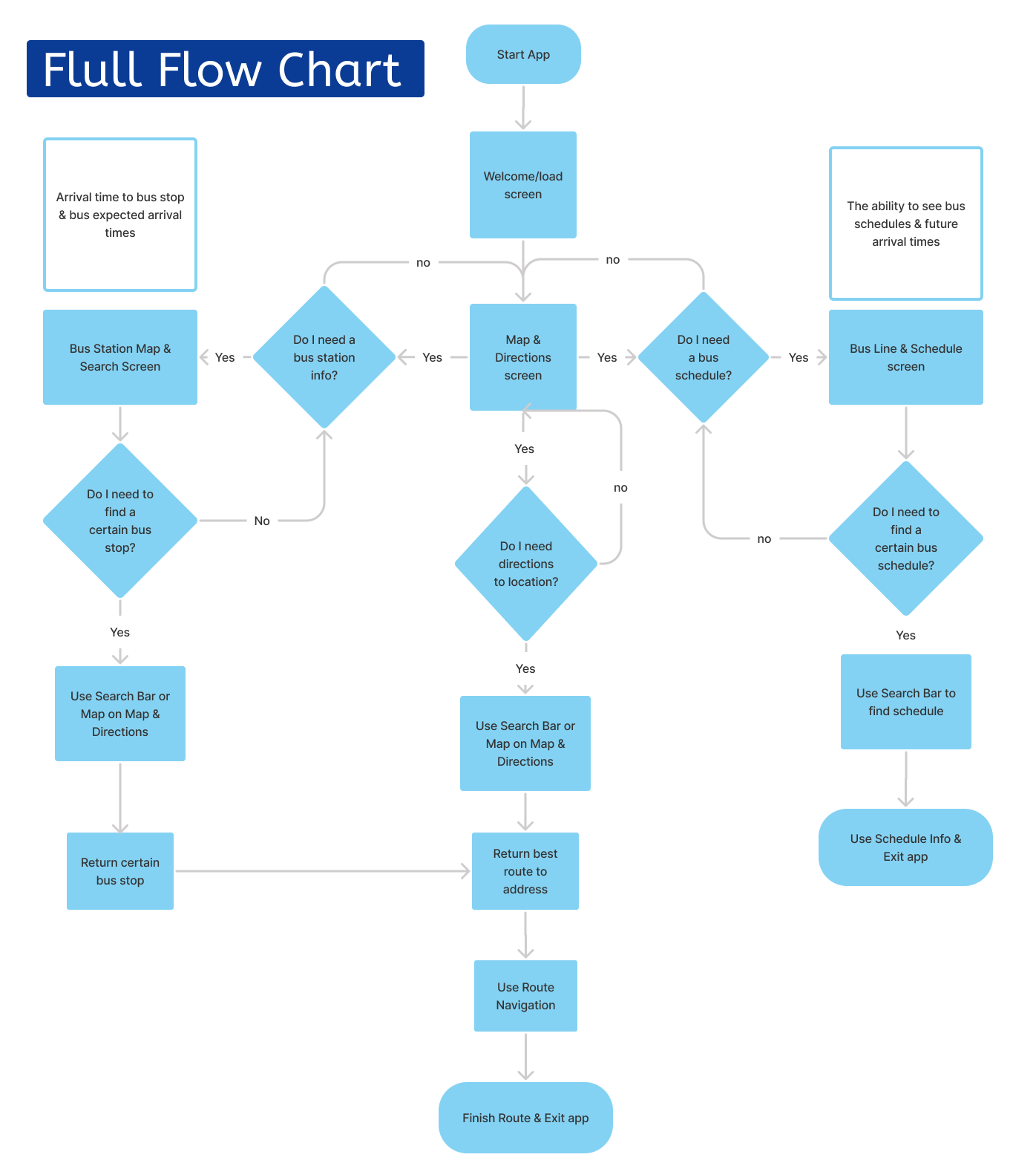
I know this is a bit out of order but I’m a visual person using these different sketches I started to think of user flows. I then focused on a main user flow and broke it up further to address different needs.
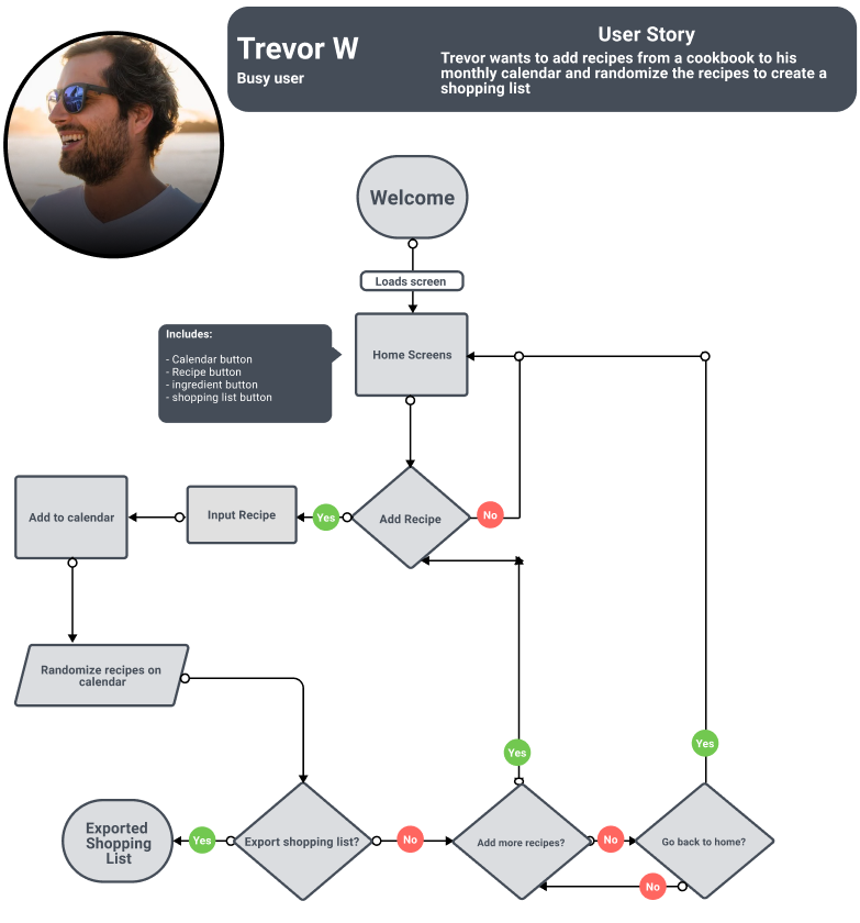
I came up with three main user flows that addressed most users needs, you can see an example in the slideshow.
App Map
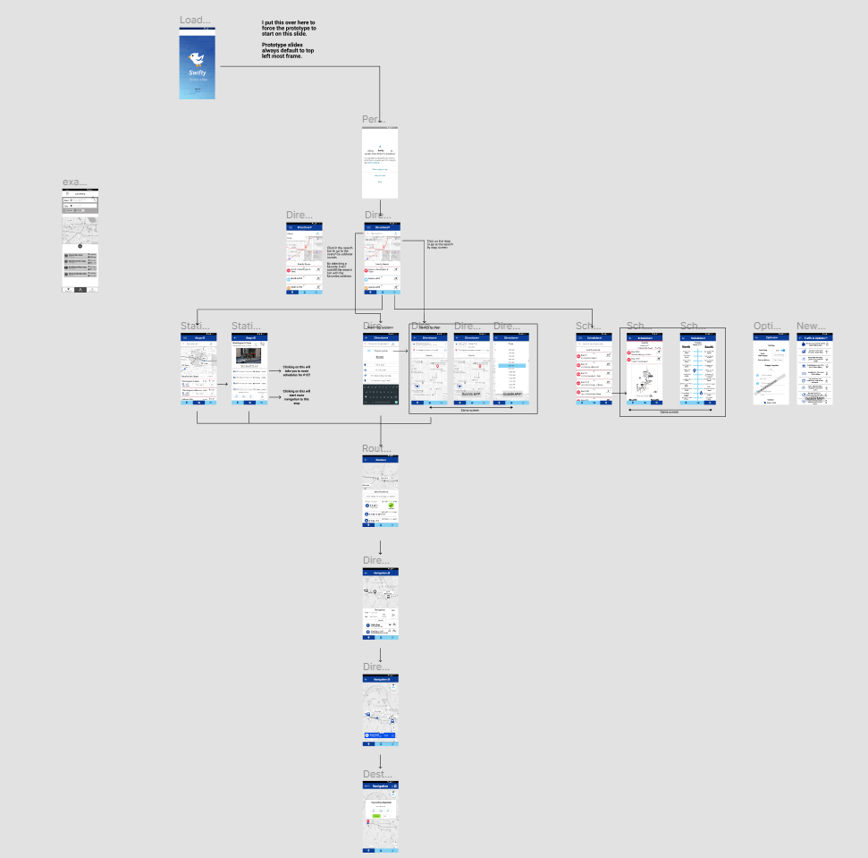
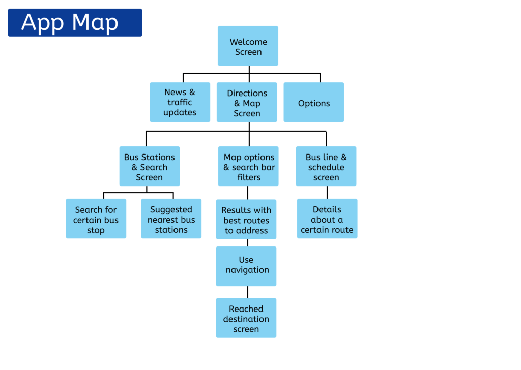
After creating some different different flows I started to work on the app map. It actually started out really complicated but I continued to see if I could simplify and simplify as I got some testing from my some basic sketches and very light wireframes. I like to test as soon as possible.
Wireframes
Now this was the complicated part. I started to do some wireframing. I started out with a little too much content upfront and that slowed me down later on. I’m used to having content filled in as possible but due to timeframes and because that causes lack of flexibility that would come back to bite me.
Prototype
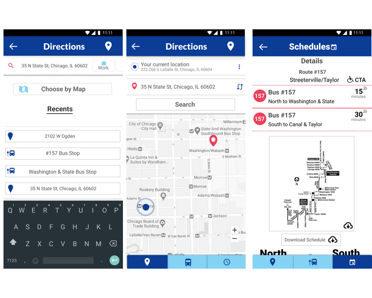
You can see by the prototype stage things started to change significantly as I got feedback from usability testing.
Branding
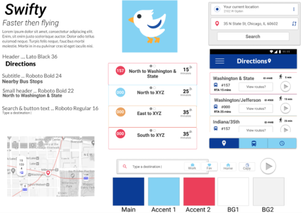
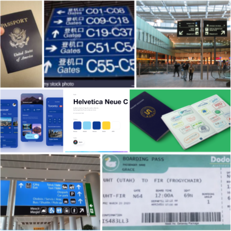
Due to the limited timeframe branding was simplified as much as possible. A moodboard was created and a style tile was also created based off that. Originally I wanted to go with a red color scheme but it wasn’t working so I looked towards airports and other common travel options to decide on a blue color.
Usability Tests
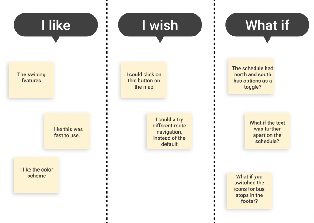
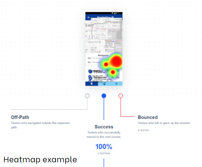
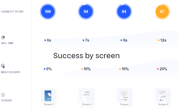
I ran two different types of usability tests, one where I would have the user go through the prototype and give me feedback over Zoom and another automated version with Maze. Both were very helpful to understand what the user was able to follow and figure out and where I needed to improve.
Retrospective
After finishing the bus app there are many things I would change. Wording in the survey, reducing content in the original wireframe, redoing the visuals, changing the wording in the Maze usability test. Many things had room for improvement but I’m happy midway I decided to take the time to simplify my screens further and implement what feedback I could during my timeframe. I learned a lot, and my usability tests confirmed my app was useable, with another round of design sprints I think this app could be really polished.
⬆ Back to top ⬆

