A fun multiplayer RTS game that never stops moving available on Steam. Literally, all units keep moving as you try and get to each new sector to defeat the doom coming!
This game was originally built in 3 days. Pretty fast right? Well… Full development would take 3 years!
I thought it was a cool idea and with some online networking, I helped us show it off at SXSW with a free booth. It helps to be part of a lot of game dev groups.
Well, it was quite a journey. I learned a lot, and here are some things I took away from it. While working part-time and sometimes full time this game was just something to do in our free time.
Scope ~ Anything – Budget ~ Doesn’t Matter – Role ~ Artist/Designer
The Brief
RogueCraft Squadron or RCS for short was originally a short game jam. I did the art, and it pushed me in something I always struggled with – Consistency. But I wanted to build this game into a real full-fledged game, so I convinced my programmer to keep working on it. Great idea right? Well, we learned a lot.
Problem Statement
So here we have this game, it’s a cool, interesting concept but what problem is it trying to solve? Now hold up you might say, games solving problems? Games don’t solve problems. Yes, actually they do, let’s think about this.
What is something that doesn’t solve a problem?
A clone, knockoff, cheap, or fake product. How was our game addressing the problems in the marketplace? How did we distinguish ourselves? Well…. We had the ability to move every unit and building. Did the art stand out? It might have in the beginning but I struggled to keep the art style similar for 3 years. Did the story stand out? Well… Looking at this again 4 years later, I don’t even remember it. Gameplay-wise, it was alright, but not amazing.
Solution
After years of work, we finally released something. We had tons of people test it, and give us feedback, and we worked on some of it. How do you know what the best feedback is? Is negative feedback important? Positive feedback? What is the best use of your time? We gave it a guess and pivoted a lot to come up with a multiplayer real-time strategy game. This game wasn’t originally multiplayer, but we added it midway and it is so much better for it.
The Process
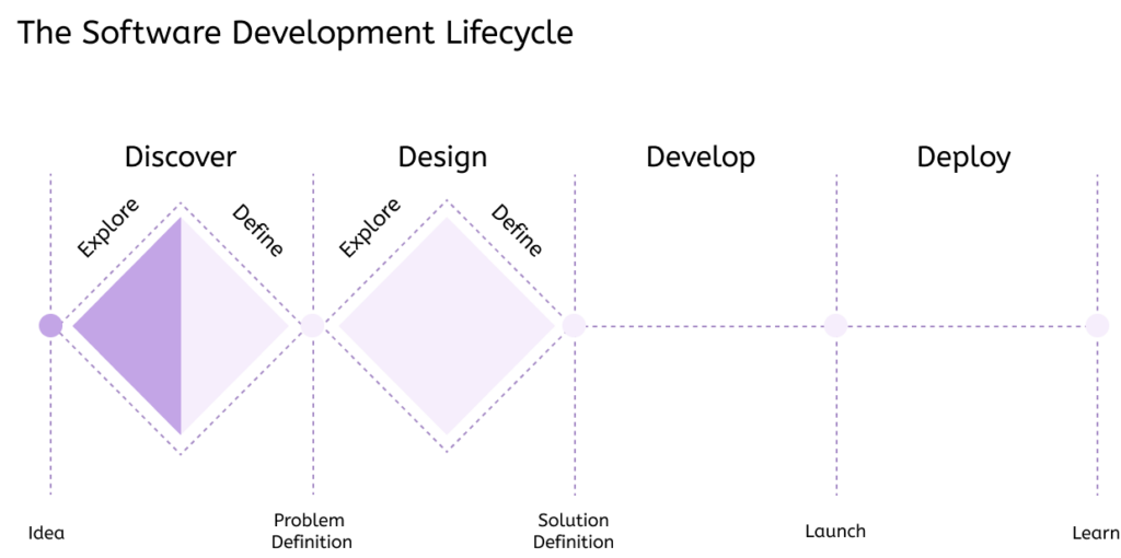
This is what good design looks like. In the Discover and Design phase, you will prototype and see if the audience likes your idea and if the market will support it. But I had never heard of this, I didn’t have a background in UI/UX design, and I didn’t know much about design processes outside of limited game design. I was missing a lot of product design and strategy during this time. So what did we do? I call it the H software dev cycle aka mindless testing and designing at the same time.
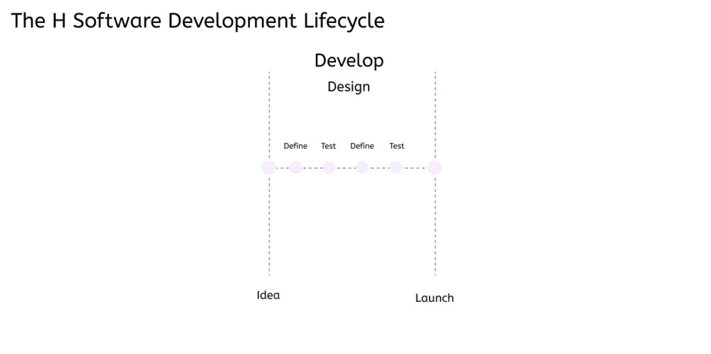
So this H cycle was great in that we got a lot of feedback, but the feedback was all over the place. We had no set goals with the feedback and were just looking to “make the product better”.
What is better though?
Without clear goals and reasons to follow those goals, you can easily fall into feature creep (FE) and underdesign (UD).
You focus on adding too many features that were not planned out which often causes underdesign or poorly designed products or experiences.
How to tell if your project has FE and/or UD
Can you easily prove why the work you are doing is important? Do you feel your project is organized enough you could hand it to someone else without explaining a lot of it? If not your project might have FE and/or UD symptoms. Do you suffer from communication issues? Do you suffer from brain fog and lack of direction? Do you feel time constraints or lack thereof? Yep, this is the problem with short-sighted goals.
Because we kept starting and stopping and changing direction so often it was hard to focus and find what made us amazing.
How to solve FE and UD
FE and UD are hard to tackle once they infect a project. Often they start off as harmless ideas that grow into a desire to cheat by working on the “fun stuff” or focus on fulfilling a personal goal that the user would not care about. UD especially comes from time pressure, lack of prep work, and lack of organization.
Steps to solving FE and UD would be focusing on the user and business needs, this can be done with the following methods – surveys, market research, personas, interviews, problem statements, how might we’s, wireframes, user testing etc. You can wrap this up into something called User Experience (UX) and this validates why features are important.
Something else you can focus on is design systems. Design systems help organize work to bring clarity, direction, save time, and help with communication.
The problem was we had no idea this project would take this long!
We thought give us 3 months and it will be done, 6 months and it will be perfect… 3 years and well, we did manage to publish it. But just barely…
No, and it was painful not having these systems. I had never heard of most of them, especially in games. Most of what I knew in the past was game design docs (GDD) which I had found to get outdated so fast no one would actually use them.
New Techniques
Style Tiles
Towards the end of development, I started creating a template for my art assets. Yep. Took a while. I ran across something while browsing online to find better methods and it was called a Style Tile. I ended up making one.
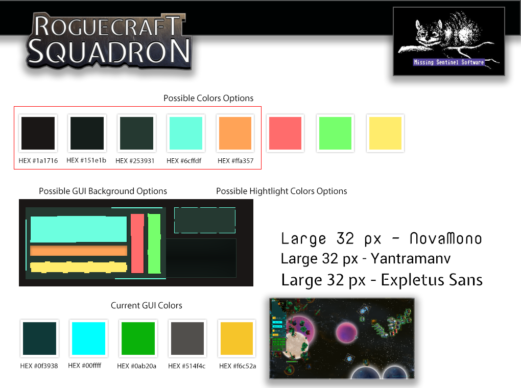
At this point, though art assets were all over the place, we had changed direction so often in design, art, and code it was hard to make sense of the art style anymore. It became too hard to pivot because of technical debt, design debt, and art debt. Basically, we have gone too far in one direction to change now because the cost and work are too much.
Still. I liked the idea of creating style tiles and think it’s a good idea for starting new projects. More modern designers might create organized artboards with various components in Figma like here. But this was far before Figma was around. So I would create “Super files” in Photoshop that had all the styles set up and I’d just need to drop in the art asset to get the effect I wanted.
Wireframes
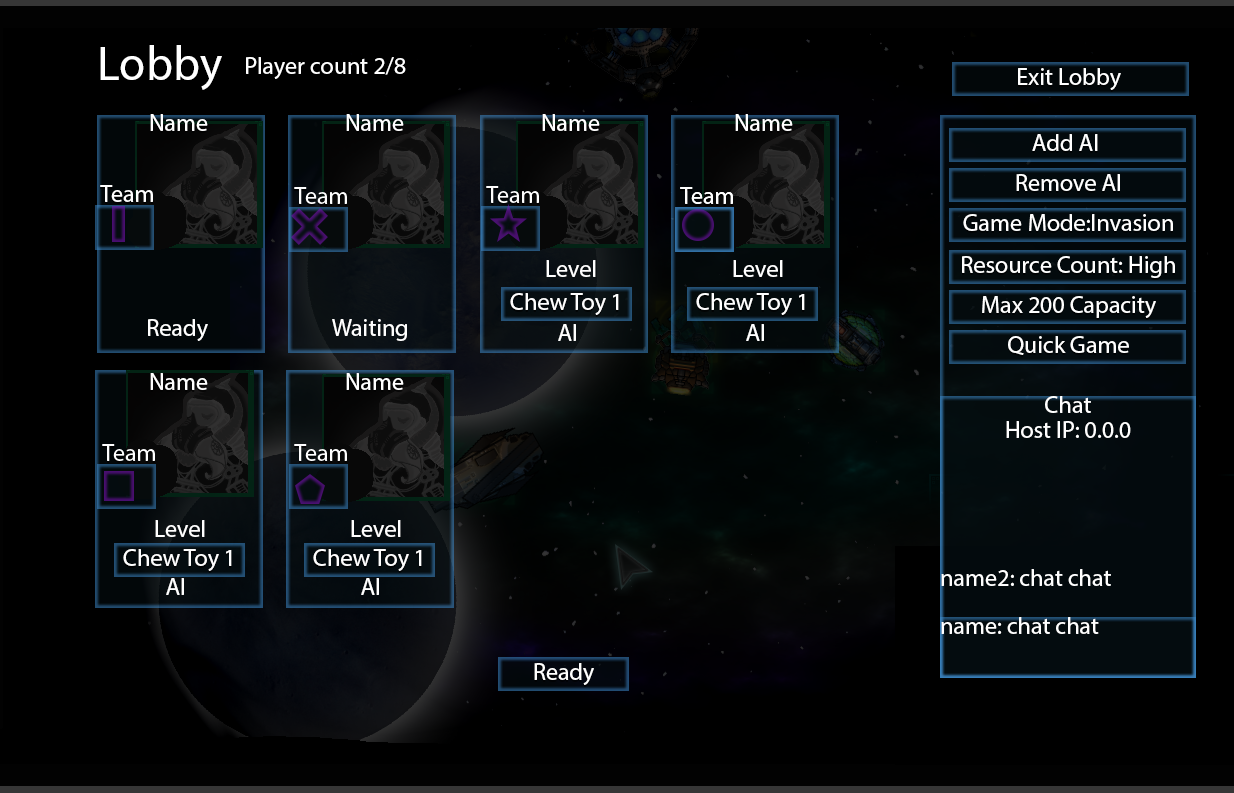
Wireframes. I created a fair amount of hi-fi wireframes, often I have to figure out the content so I don’t work in lo-fi very often and RCS was no different. I created a variety of wireframes, not all of them made it into the game but I figured I’d show some of them anyway. I created a lot of wireframes before I really knew a good term for it, I suppose mock-ups might be best.
User Testing
User testing… Well, about two or three times a month for like 3 years we would gather feedback on what we changed in the game and tried to market the game at the same time. I’d say user testing was very helpful for the tutorial we did eventually create but because we were not sure what to test, our user testing was often not helpful. Our audience was basically anyone who wanted to spend a few minutes playing at our booth. We would ask users questions and help them walk through certain sections until we got a working tutorial up. Our tutorial system was something we tested to see if the user could pass set tasks and we would ask them what they thought about certain tasks.
Summary
What went well with RCS was tons of user testing and interacting with a variety of users in different places and in different ways. But for everything else, we really needed a design process. We started with an MVP idea of what we wanted for the game but missed a lot of Why, Who, What, and When because we didn’t use a design process to really think about the idea before diving headfirst into it. We didn’t have a strong grasp of who to market to (no SWOT or market research), no great idea of what problems our game solved nor ways to stand out. We struggled, pivoted and reworked code, art, and design often because the design was underdesigned. We didn’t think we would need to design for so much in advance. I was always playing catch up trying to design the game as we went which caused a lot of long-term problems. Had we, from the start sat down and designed this long term it would have made for a much better design experience from the start.
So why did we not do better?
Lack of design and system designs in place. It was a lot of inexperience and lack of time. This would lead me to study UI and UX to learn more ways to improve in this department. We struggled a lot to get a functional tutorial, and knowing more methods to improve user experience would help in the future. If we had funding for our game and could work on it full time I’m sure things would have been a lot easier too.

