The Brief
Scope ~ 3 month – Budget ~ $4,000 – Role ~ Solutions Designer
My client was an immersive murder mystery experience company. Players look for clues and take notes as they play as different characters in a set role. Currently, the game is all paper-based but there is a desire to turn it into a digital format. These games are similar to popular Chinese Detective shows and Korean Detective shows etc.
Problem Statement
The notebook for characters to scan through is lackluster and not as immersive as an app could be. The key goals of the app were to make it easy for users to take notes, look for clues and get more involved in the space.
The long-term goal of the app was to be used to create games, host games, and allow easy game editing for the game master. These games could interact with other Bluetooth devices such as speakers or projectors and the game master could manipulate the environment for his purposes. To keep it simple for now we would build a simple AR demo on the iPad. An iPad would be something the client would use as a game master.
Solution
The solution was a short prototype that I built. I had to rework the end UI a bit but I think it turned out alright for my time limit and budget. There was quite a lot of iteration during this process.
Process
Part of the process was play-testing a version of the paper game. While it was meant to be done in person I played it remotely. Based on the playtest it made it a little easier to understand the game and look for pain points the user would run into.
I identified 3 big pain points I wanted to address and the client agreed it was a good idea to look into it.
- It was hard to keep track of clues, one game had what seemed like 50 clues, and tracking all of them was complicated.
- Characters, it was hard to remember the large cast of characters and the differences between them. Group games were often 5-10 groups of people.
- Paper… A notebook with dialogue was a game with a host leading it. It could sometimes be hard to focus with not much to do.
Research
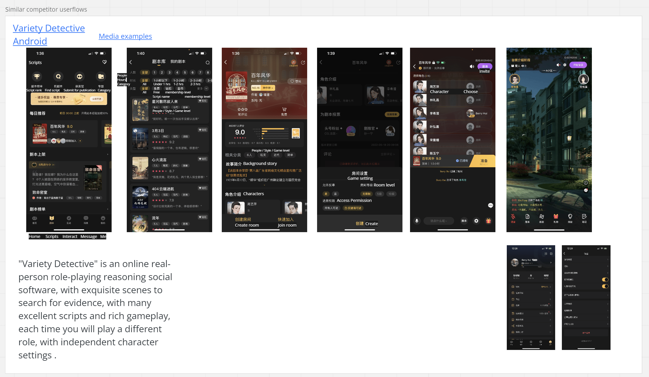
To get a better understanding of how other companies approached this Asian genre not common in the West, I researched similar types of apps. Unfortunately, I did run across language barriers and had to ask for a fair amount of translation help.

More Notes
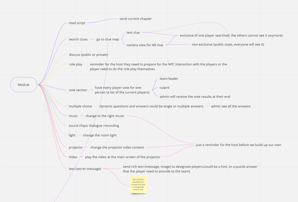
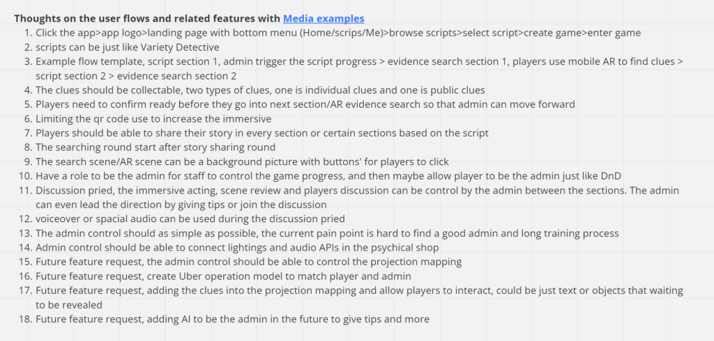
The goals were very large for such a small budget, with some back-and-forth big ideas for user flows written down that would be simplified even further to focus on something very basic for a demo. Again this was being translated back and forth so I chose to continue to simplify the idea more and more.
The main thought was that long term, this would be 3 different products in one. One for the game masters (control environment sounds, screens, game text), one for the users (play the game through the app), and a game creation option to allow game masters to create and set up their own game.
Sketches
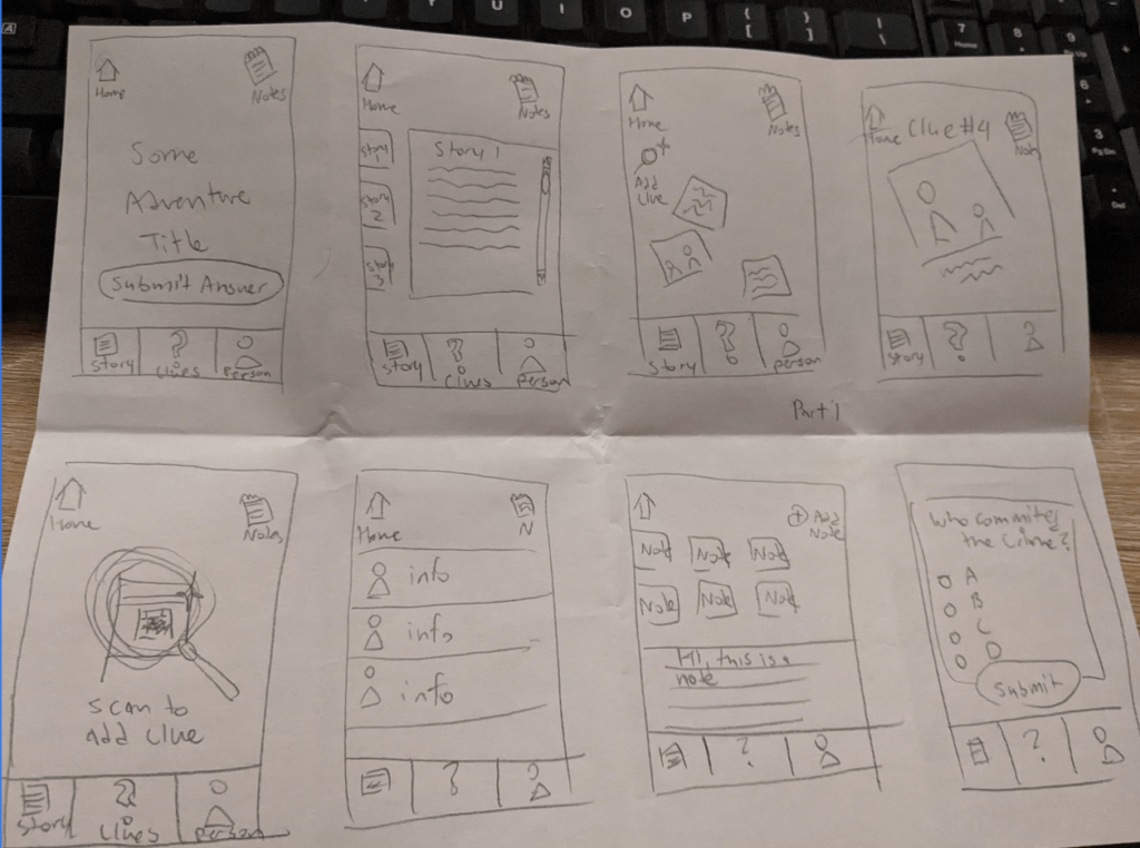
I did some quick sketches based on some initial ideas of what we might do. These are called crazy 8’s if you know the term, it’s a good way to start thinking about the design process.
Wireframes
So this was a 2 part process. Originally I thought we would be working in 2D as we worked with paper but it was decided to go and transition into 3D. I still have some of the original concept art for some of the 2D flow.
V1 Flow – this was cut when we changed directions
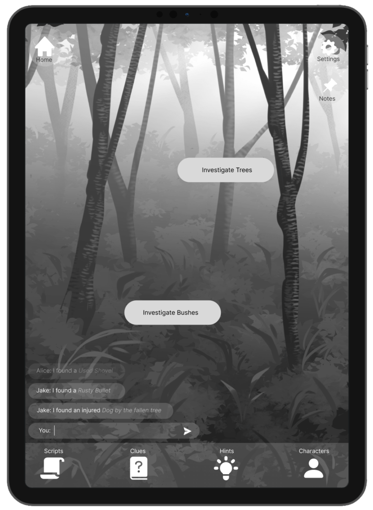
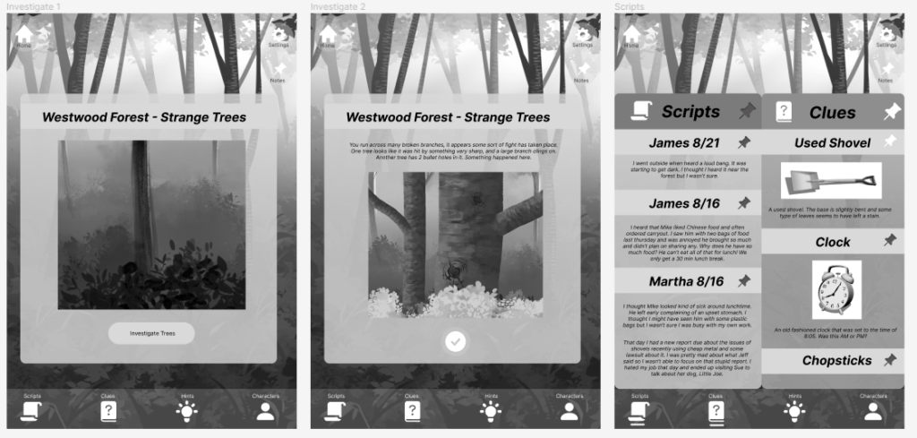
It was bare bones and very basic.
V2 Flow

The next version of some of the flow allowed the user to place 3D models and search them for clues.
I also did some quick mock-ups for an editor but lol once you actually start coding and testing the product you realize how dumb some of your design ideas were….
I’d need to redo a lot of how I envisioned the editor after I made the prototype… I mostly just focus on figuring out the flow, the visuals above often will change significantly during production so I don’t spend as much time perfecting it as I could. I know that paper/digital prototypes are possible to create before I attempt to start production but I was itching to see my limitations on the software side of things and understand what technical issues I would run into.
Building the Product
So I went ahead and built out the product in Unity. I used PlasticSCM as it is just faster than GitHub. I have to be honest I’m no amazing programmer and with my experience working in small studios, I understand that something buying and modding packs is a good solution. So I did put some of the budget towards assets and packages such as a rope package as creating a setup with the rope twisting correctly around a character is complicated etc. I spent some time here just trying to understand how to use the packs and mod and extend them further for my needs and the rest of my time went towards that. We went through 2 UI changes the client decided that a Sci-Fi fit his idea better and I modded some UI to work correctly when a camera was displayed in AR etc.
3 Headaches I faced
1) Trying to map a story space to the client’s real-life game room in San Francisco. (That was a headache, but we got there!) So this scene is particularly set up for the room where he does demos. I don’t live on the West Coast, a big chunk of time went here.
2) Rope asset issues, so because this rope was procedurally generated changing the local scale and position would cause a lot of issues with the rope particularly as AR assets are tiny and this caused some bugs. I had to make up a solution of setting up the asset far out of sight and just pop it into place to overcome this problem I ran into with the rope. I was puzzled for a long time by that… Maybe not a good long-term solution but it’s a prototype… 😅
3) Converting between different anchors when it comes to saving, loading, and altering spaces was something I got a little confused about but I got there. You cannot directly save a prefab to where you placed it so you have to manage that separately by code.
Anyway, the demo was completed, tested a few times, and was good enough for now. The client was investing a lot in his physical space and didn’t have as much budget for the next round of prototyping but that’s okay for now.

