
3 Week duration • 50+ Screens • 6 Designers • Tools

Summary | Solution | Role | Audience | Scope | Process | Retrospective
Summary
Our client, Trevor, wanted an easy to use meal planning app. He wanted to be able to add recipes and have it generate different meal options for the month. He was a busy guy and wanted it to send him a shopping list when it was done generating the meals. He would get bored with his food so he wanted to be able to generate different meal plans whenever he wanted, so he needed customized meals and lots of very flexibility.
Problem Statement
Our client enjoys cooking at home but does not want to constantly choose what to make on a daily basis. They would like a product that helps them plan their entire week or month. They also need help tracking their recipes and available ingredients. They wanted a website in particular for this task.
Solution
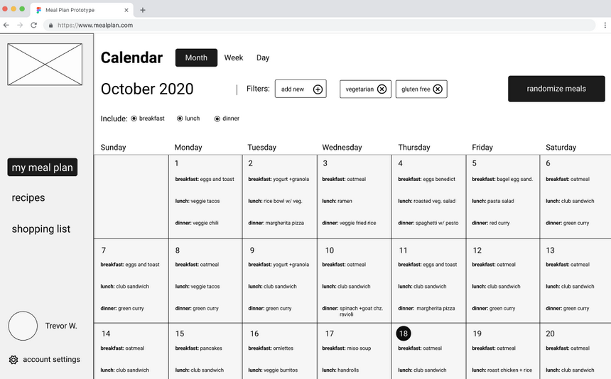
Our final solution was a website that would generate a meal plan, store and suggest recipes and generate a shopping list. We called it Meal Plan Pro. The idea was the website would be a Progressive Web App (PWA) which means it would be responsive for different devices so it would work on mobile, tablets and other screen sizes. For the scope of this project we aimed just for desktop sized screens.
Roles and Responsibilities
Senior Designers: Teacher Assistants
Role: Project Liaison and User Experience
Design Lead: Instructor (Monica Longmire)
I helped set up client meetings, scheduling, and worked to manage the kabam board in Notion as the Liaison. As far as User Experience goes I helped with some aspects of the wireframing in Figma, and recommended better experiences for the animation, originally we had too much animation and we had to tone it down to be easier to use.
I also helped in other ways as well, helping with the personas, empathy paths, SWOT, user flows, sketches, recommended wireframe improvements, and helped with usability tests and some aspects of our presentation.
Users and Audience
After talking to our client we decided our target demographic would be generally busy young families, working adults, and users who were health-conscious. Knowing this information we built out different personas, empathy maps, and journey maps to help address the needs of the different users.
Scope and Constraints
We had a very limited time frame for the project, three weeks with no budget. This could be considered a short three week design sprint.
Process
Discovery and research
We used a design sprint model called “agile” that allowed for fast iteration on sketches and ideas. Over the course of three weeks we would work through different stages to complete the project.
Let me break down this down further.
Part of understanding the project is early discussions on requirements and features and knowing the potential audience. We used different techniques to manage this. We interviewed the client for the starting requirements and began to think about how to design for it. We came up with a Problem Statement based on client feedback.
User Pain Points
Meal Burnout
Users would get tried of recipes
Disorganized Recipes
Users didn’t have an easy way to collect and organize recipes
Shopping Confusion
Users were not sure what to buy
We were also able to identify pain points from the client to create our problem statement. Those pain points would be: meal plan burnout, recipe disorganization, and shopping list confusion. These led us to finalize our problem statement.
Solution Statement
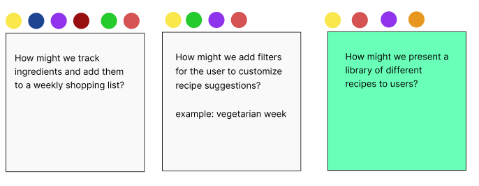
We followed up with a Solution Statement in the form of something called a How Might We (HMW) exercise. We voted on what we thought would be good questions to ask that would help our problem statement.
Our final HMW would be:
- How might we track ingredients and add them to a weekly shopping list?
- How might we add filters for the user to customize recipe suggestions?
- How might we present a library of different recipes to different users?
Proto-Persona, Empathy Map, and Journey Map
From here we worked on different personas to help understand what users would be doing, thinking and feeling when faced with our problem, how to make meals that were fun, and easy. Below were two personas based on people who showed interest in our website, and we added a proto persona based on who we thought might also like the website. (Below you can see different personas the team made)
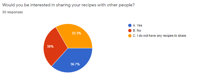
Survey
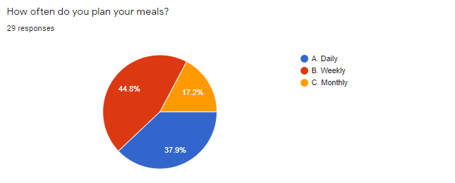
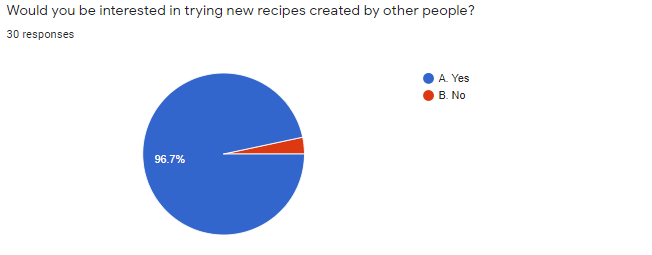
After understanding our problem and potential solutions we started to find potential users with a screener survey. This survey would not only give us good insight into possible users, but would help us understand more of what people wanted from a website like ours. We had 31 responses and we had a lot of qualified users happy to test our work (7 usability tests were scheduled from our survey) which was great!
Some insight gained:
- Users don’t want to decide what to cook every night
- Planning what to cook is time-consuming
- Not having different recipes will result in boring meals
- Most users work around a weekly meal plan
[su_image_carousel source=”media: 1339,1340,1341,1342,1343″ crop=”none” align=”center” captions=”yes” autoplay=”0″]


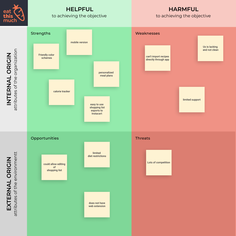
Competitive analysis
We looked into other competitors and found some similar websites and apps. We would use this information to decide what features would make us stand out. The ability to add recipes from so many sources was one way we would stand out from our competitors. (Below you can see an example of our swot)

Information architecture
User stories & user flows
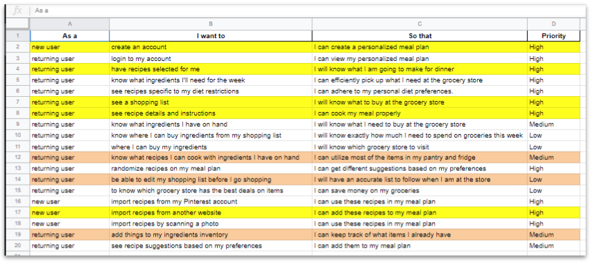
With the insights we gained from our survey we were able to focus on user stories and user flows to determine the most important features and flows of the website. We prioritized particular user flows such as “see recipe instructions”, “see a shopping list”, “import recipes” as these were highly requested features from both the client and the users from our starting survey. A far amount of these features were also some of the ways we stood out from our competition.

I’m a returning user that wants to be able to view my shopping list so I know what to buy at the grocery store.
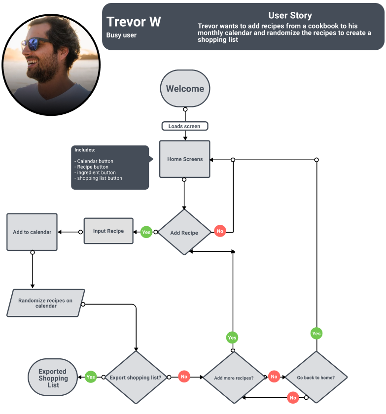
Example user flow for adding a recipe
Some examples of sketches and wireframes we created based on these flows
Sketches
Our team worked together to think about how sketches of wireframes might look


wireframes
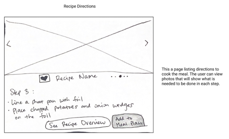
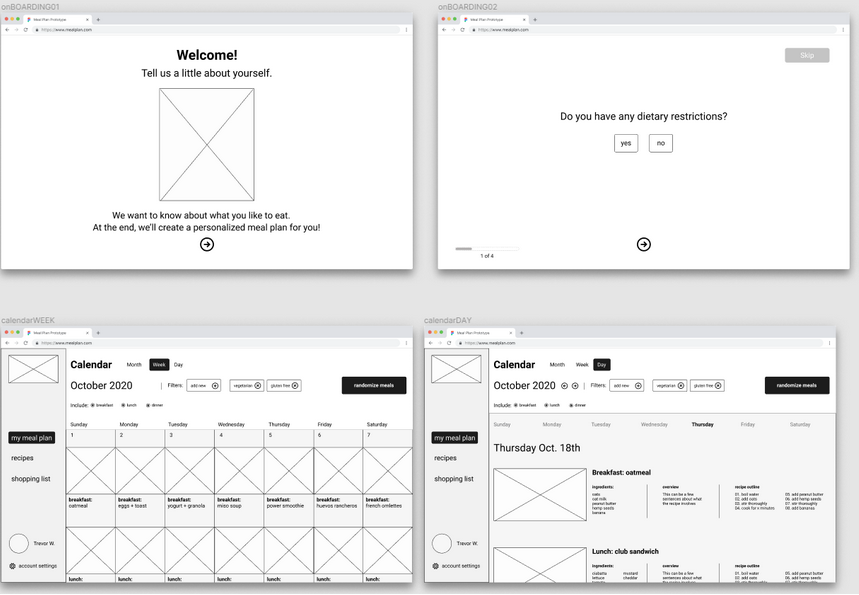
Now we started to build out and create different wireframes. I made my own suggested wireframe and some aspects did end up in the final design.
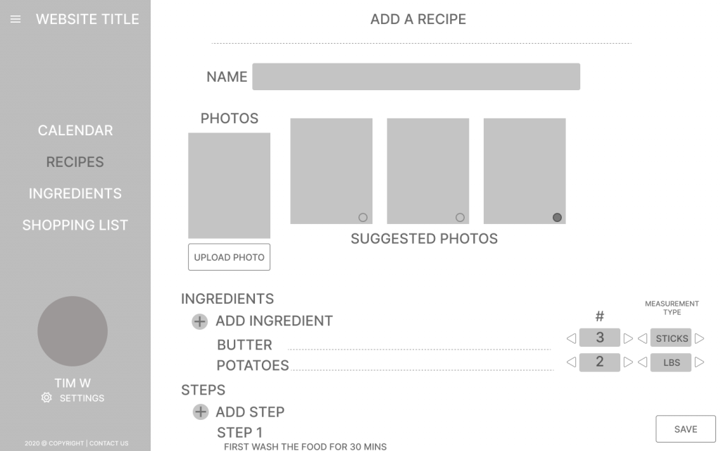
Some of the final wireframes are shown below
Usability Tests
Once our prototype was completed we went to work on useability tests. We had users try it through zoom and also through third party software called Maze. Some of the tasks we would ask users to do was things like, “add a recipe”, “view the shopping list”, and “create an account”.
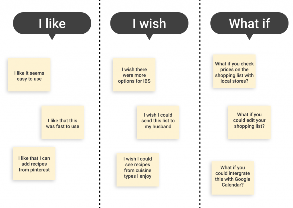
I helped take feedback from the useability test and put it in an easy to read format like so. These were different comments we received from users while they tested the website.
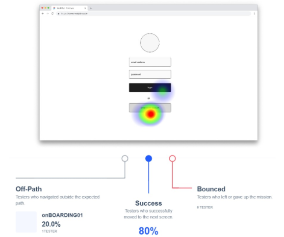
Here is an example from Maze using heatmaps where users clicked as they started to create an account. You can see the success rate of different users and how well this screen did. This method was very helpful for understanding where users expected to click and to understand how successful each path was.
Retrospective
And that concludes this case study. Since branding and high-fidelity prototypes were out of scope our team would be saving that for the next design sprint. We learned throughout this process better ways to stay in scope by understanding what features were critical to the project, and we learned how important the onboarding process was, as our usability tests revealed we had friction on some screens (which we did end up moving to a different section of the website to make onboarding smooth and simple).
 Back to top