The Brief
Scope ~ 1 month – Budget ~ NA – Role ~ UI/UX
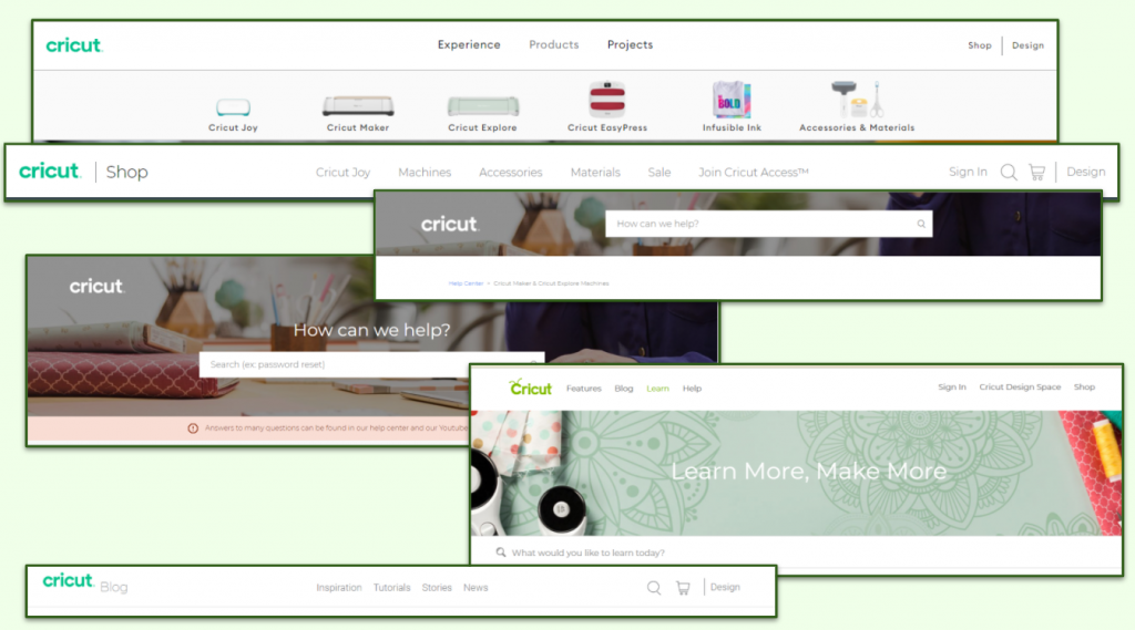
Cricut is a cutting machine company that specializes in machines that cut paper, cardstock, leather, wood, and more. Users often visit the site but new users will get lost due to how the site is laid out and presented.
Problem Statement
The large scale of the website has led to many usability issues, navigation is hard to use, and it can be a struggle to find information.
Solution
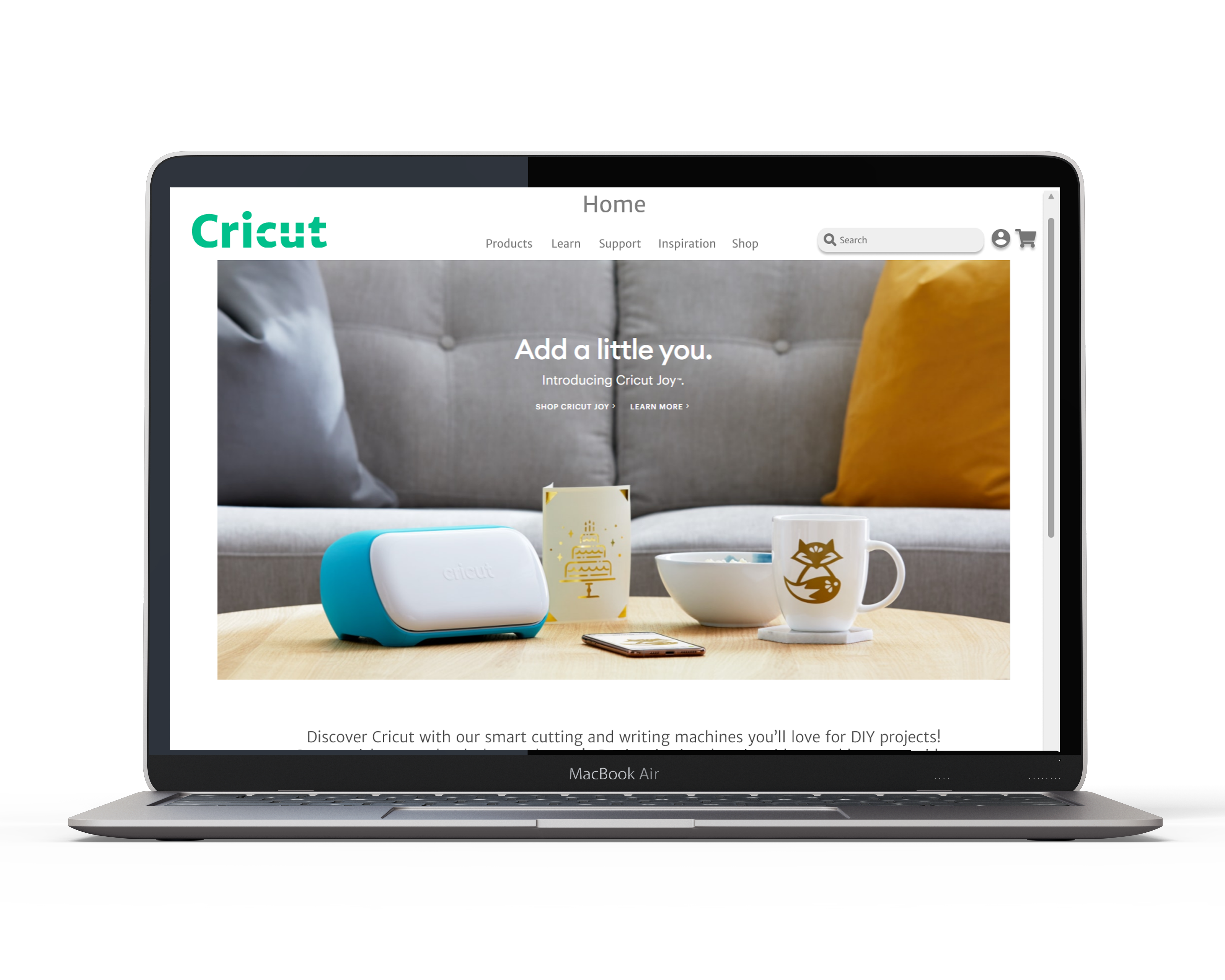
The final solution was a website redesign that addressed usability issues such as navigation issues, global search, missing headers and a soft branding change. The top pain points were also addressed – inspiration, learning, and troubleshooting.
The Process
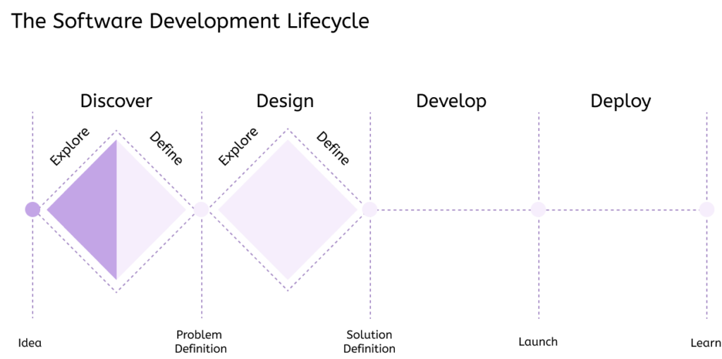
Whenever tackling a new problem, the first thing is to work towards understanding it and exploring the problem. Research helps you to understand what you should focus on, and from there you can define and further explore ideas as needed.
Usability Heuristic Report
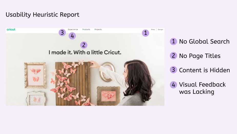
I started my research with a Usability Heuristic Report, this report points out common issues on most websites and a variety of templates are available. My finding’s pointed out many places the user could get lost.
Surveys
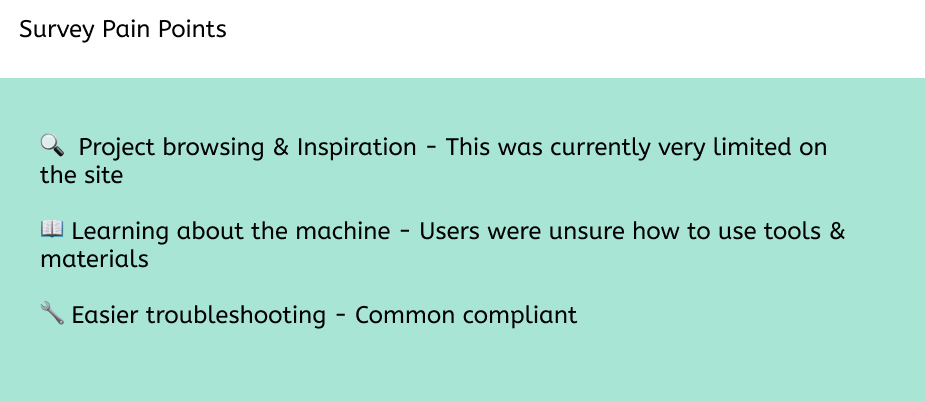
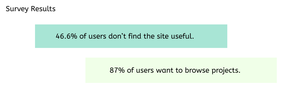
I continued to do research by running Surveys. To understand my audience and what things they would like to do on the website. Here are some of my main findings.
I continued to interview users to understand more of what they were looking for and where they had concerns.
“There’s too much like, I don’t know, uncertainty [with the website] that it’s like I already just don’t feel like I trust the website, which kind of sucks because I actually really like the idea of having a Cricut, but I feel like I would have to just never use their website. I probably [would] just YouTube.”
“I just do vinyl and cardstock but I want to try other materials, but have no idea what to make.”
User Personas
These were created to think about the user while designing. These personas were based on interviews and surveys.
Top User Pain Points from my personas
- Currently, the website lacks project organization & limited inspiration
- Currently, the support and troubleshooting are a bit confusing to navigate
- Currently understanding the products and materials is challenging
SWOT
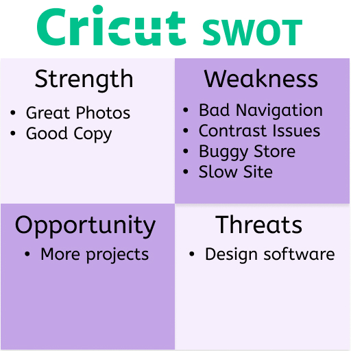
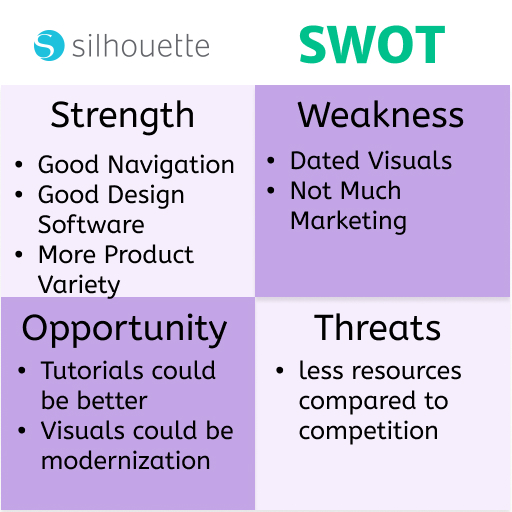
I created a very simple Strength Weakness Opportunity Threats chart to look at the competition and some of what they were doing. There was not really a lot of similar competition in this field, the next competitor would be Brother but they did not have anything very close machine or software-wise. If you want to view more on the competition there is a more in-depth study here.
User Stories & User Flows
User stories were developed to help understand important tasks and prioritize what should be focused on. This was combined with user flows to understand the direction and what would be necessary for the redesign.
Sketches
Following this I worked out some different sketches and covered more of what the page layout might look like, I often would use Crazy-8‘s to get ideas.

Wireframing & Prototyping
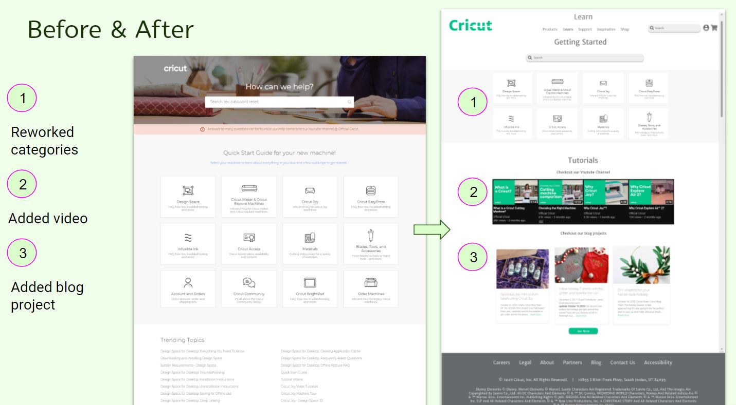
I was able to wireframe and prototype different page layouts and test them as I went to see how users liked them. I went through many different variations, below are some examples of how pages changed.
Accessibility
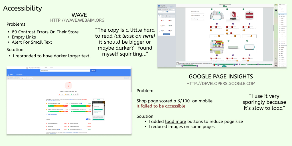
I looked at different aspects of accessibility to see what I could improve on while working on the wireframing and thinking about branding. I used Wave to look for accessibility issues and found small text and contrast issues in the store. Even I was having trouble with some of the text. I also ran Google Page Insights and Cricut’s website is almost unusable on mobile devices scoring a 6/100.
Branding and User Interface
After looking at ways I could improve accessibility I thought about ways to rebrand Cricut and work on improving accessibility while also giving Cricut a more modern look. I started first with a moodboard of images I found fresh and related to crafting.

Usability Testing
With all of this in place, I started to run some usability tests to see what worked and where I could improve my design work. I found some tasks were not phrased well but overall my results were very successful but I found some areas I could improve such as the project browsing.
What if the Design page was renamed to Inspiration?
– This was a suggestion I would implement from my useability tests
I worked in different types of feedback and ran both moderated and unmoderated tests to improve the product as best I could in my timeframe. The users often made good suggestions and I would ask them a variety of questions and tasks as they viewed the product but I also wanted to watch them explore and play with it to see where their main interest would line. I studied where users would click and looked for different patterns and types of users, some users did not notice icons or particular patterns I expected them to and I decided to rework some bits of the design to improve that.
Retrospective
In conclusion, I was able to address all my user pain points by improving the navigation, reorganizing pages and content, making pages more accessible with branding and reorganization, adding pages users requested such as project browsing and search. I added additional purchase funnels and made it easier to find out what products were compatible. I learned a lot tackling this project and enjoyed working on updating pages, there is a lot left to do, but I think with this design system in place it’s much easier to rework pages into a pattern users expect. Below are some pages that changed through this rework. Some examples of what I achieved below:


