Intro
For this project I was asked to make a simple demo I could show to some shareholders. While the deal fell through I still have a demo I created using EasyAR.(This is the Chinese version. There are a lot of assets with this name!) I used this instead of Google’s ARCore which if you understand the AR world is a pretty big deal. Gotta say this stuff is fast, so fast I’m amazed Google is so behind.
Easy AR Mega (from their website above) was very advanced for most AR applications
Originally I was going to use EasyAR Mega and build this myself but the docs were all in Chinese. The location where this tourist app would take place was in China as well. In the end, my team decided we would hire a third party under us to test on-site and work with them on the app. We were in talks with other studios but with the funding not taking off this project died off.
Still, I did make a simple proof of concept with the light version of this. I did some mock-up stuff so I had a better idea of how it would look long term but this would be something that would take iteration and testing to understand.
Concept/Idealization
I created some mock-up art for the project and prefer to start by working in black & white. Here are a few quick ideas of possible screens and how things could look. When working in black and white you prioritize contrast and layout. With AR these can be some most impactful design decisions early on.

Since originally it was just going to me as the main person to create the app I went very simple. I knew I could at least create the things above. Working with another team would free up so much of my time, that we would no longer need the limitations above.
In the end, for the demo, we kept it simple (as it was pro bono) and we just needed something to show off a feature or two. So I created a simple photo scan scene and created an AR cooking game. We ended up cutting the photo scan because it was annoying to have that particular photo on hand all the time. It’s easy to swap that back in though.
UI
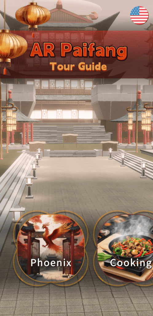
For the UI I went through a bunch of different ideas and ended up just combining them. It was a short demo so we didn’t need a lot of UI work.

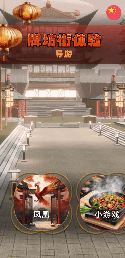
I tested the font in different languages and made adjustments after feedback. It was a stiff font so for the title I used a softer font that was recommended.


It’s not perfect. I used AI to generate graphics but I would have to clean them up to be useable and transparent so I could layer them. My idea for the UI was fuzzy so it took some experimentation to have a good of what I thought would fit. I couldn’t find a good reference to use when creating this UI. Ultimately I combined the layout of a weather app I liked with some ideas of popular Chinese items. I also used a soft backdrop that could be reused to present items without being distracting in AR. For my prototyping work, I tend to leave the graphics for last as they are the most subjective and easiest to replace. Though from a UI/UX perspective, it’s often preferred to start with graphics but I prefer functionality before polish.
Here is a sample of the app. I built out everything using a variety of assets I found or had on hand. It’s pretty straightforward.
Programming
Code wise I was excited to use something I learned in one of the Java classes I was taking at the time and apply it to C#. I had to refactor my work a few times for the mini game but it’s pretty straightforward. Nothing fancy.
